Throughout the years of observational research I’ve done across the company, one particular problem has been consistent. When a user fields a call regarding a policy, they must quickly piece together the “full story” of that policy from green screens, outdated systems, half-baked dashboards, and third party applications. This is true of people in underwriting, billing, claims, tech support, anywhere I’ve been able to watch. They do a marvelous job with the tools they are given, but there is a huge opportunity to improve efficiency by putting everything in one place. This is a vision of what that can look like.
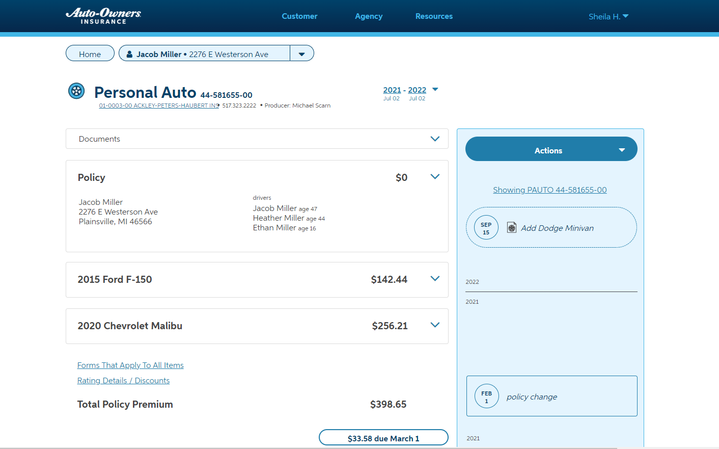
Format. The first most obvious question is “If we put everything related to a policy here, what do you do with it all?” At its core, I chose to follow a pattern familiar to everyone involved: the declarations page. The “dec” page is a legal document that everyone with an insurance policy receives which “declares” all the items and coverages. By leveraging this layout, associates and agencies have instant recognition before they ever touch the system.
The actual document is known for being quite busy, as it’s in everyone’s best interest to minimize paper. Not being bound by this, the inquiry system uses progressive disclosure to maximum effect. The dec format provides a basic idea of where to scan for various information, while deep navigation yields the details.
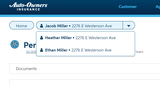
Dynamic Breadcrumbs. A policy can relate to more than one individual “customer”, which has presented complications with displaying proper hierarchy. There are many ways to arrive at the policy page. In this way, we can navigate “backward” to any applicable person while implying the customer is always at the “top” of the hierarchy no matter where you are in the system.
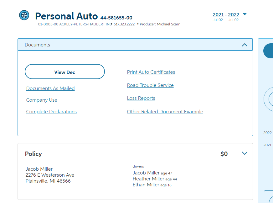
Document Access. Insurance policies are inherently littered with legally required documents. It is just as likely that a user is coming to retrieve a document as it is for them to look up policy information. The specific treatment of this section allows for fingertip access without commanding too much attention. It stays out of the way when you need it to, and its content is prioritized.
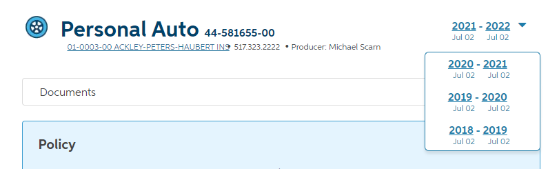
Term Selection. A policy is effective for a given time period, and in many cases the historical state of the policy is important. Inquiry is smartly defaulted to the most common “current term” with the option to select any previous or upcoming term, if available. This selector affects the entire page, so one can accurately get a snapshot of the policy at any time later.
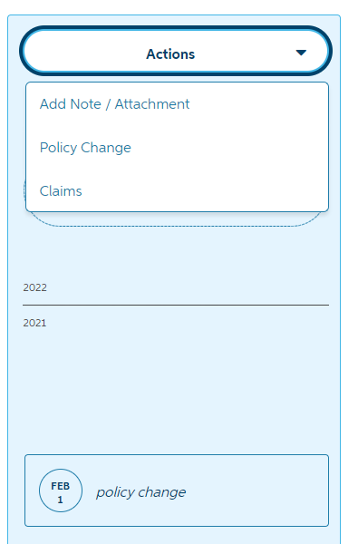
Timeline. The sidebar of the page most directly “tells the story” of the policy in chronological order starting with the most recent notes and milestones. This is a very effective method of surfacing the most important details to the user first. If a policy has a lot of recent activity, it’s a good indicator of the likely reason for the phone call or current investigation.
The timeline also acts as a logical home for taking any major action, as those actions will ultimately result in new milestones. With all the other data on the page, it’s vitally important that actions are clear, and thus it’s the only primary button on the page.