I was responsible for overseeing the design direction of a major effort to modernize our personal lines quoting products. These interactive prototypes helped characterize some of the key features, driven by user research.
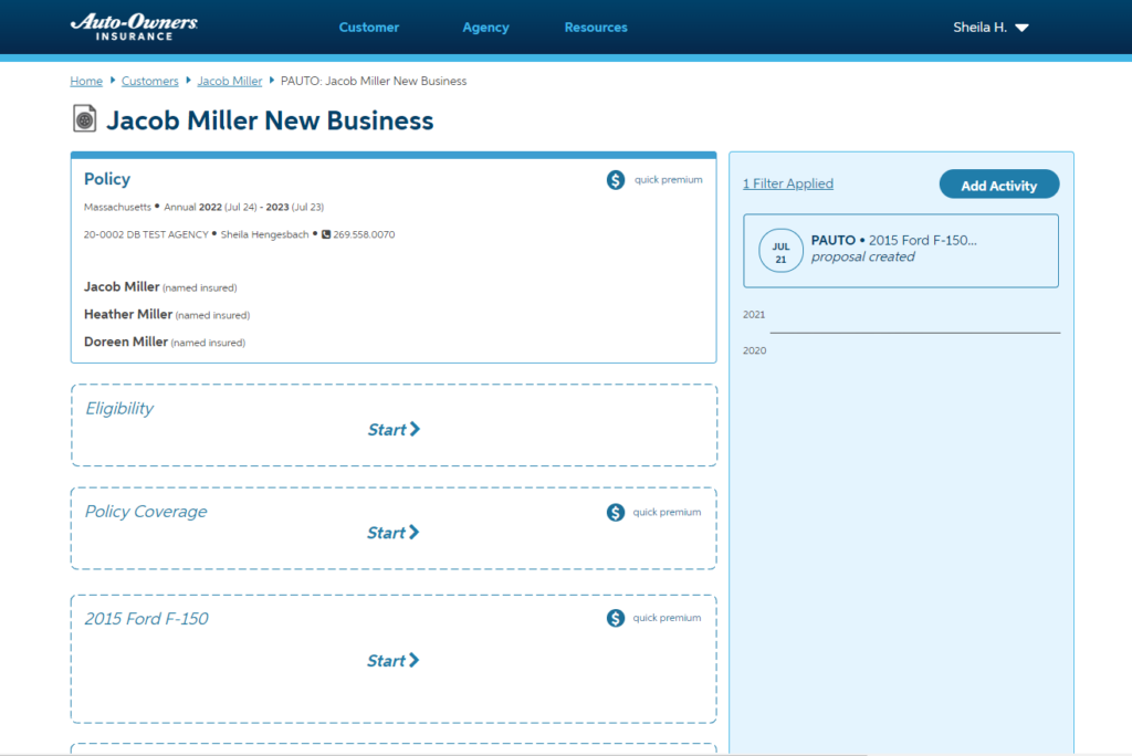
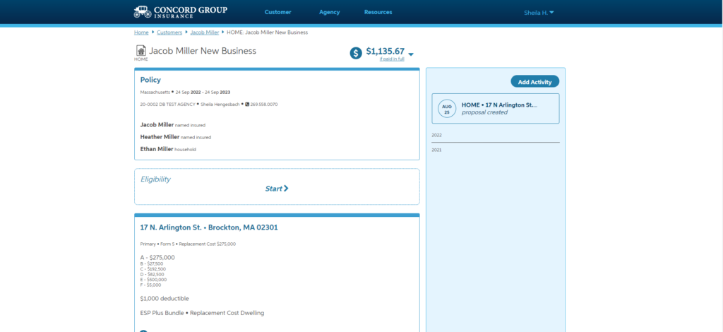
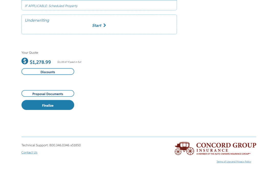
Hub Design. Our quoting systems are traditionally quite large and intimidating input systems, consisting of many linear steps. Establishing a hub-spoke model presents several strategic advantages.
It feels small. Offloading the bulk of the input to more efficient pages creates the impression of 5-6 steps instead of 40. Instead of visiting “people” or “vehicles” 5 separate times (and 5 separate page loads) for differing purposes, the mental model is condensed to handle each “object” just once.
The hub serves as its own summary. In a linear flow, it was always necessary to re-present a recap screen at the end that highlighted the input data. Not only was this page very noisy, but it also meant extra maintenance. In the new design, the user builds familiarity with the critical summary screen as they go.
Flexibility is paramount. Each customer is different: sometimes the user wants the fastest route to get a ballpark price; other times they just want to know if they are eligible for a particular company or program before they proceed with data entry. This design allows the user to go “out of order” as needed, or key the entirety in an efficient manner.
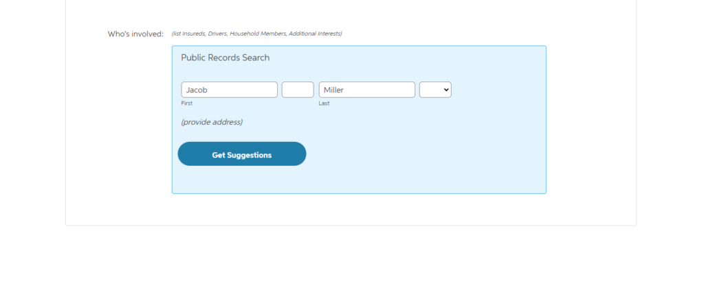
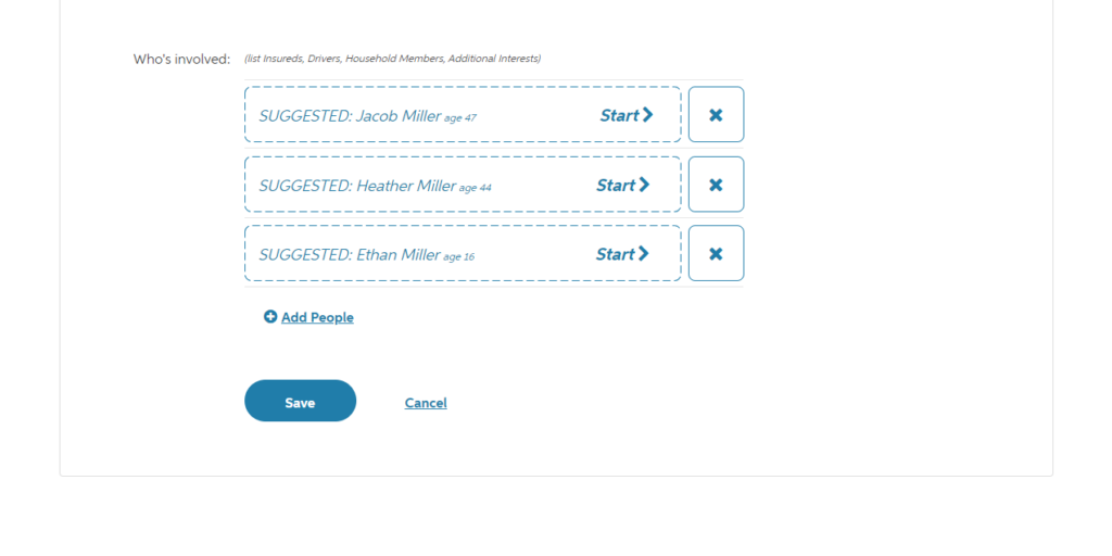
Service Integration. There are several points within each system where we call out to third-party applications to help speed up data entry and provide more reliable data.
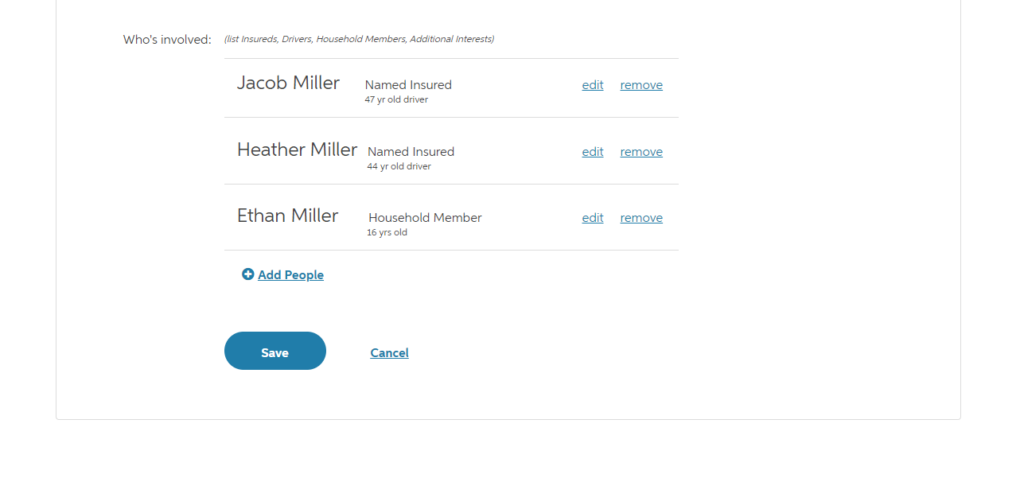
The first typical step in auto insurance is to look up a person’s public records in order to provide suggested people and vehicles. Here the design implements a simple add-to-list pattern but helps to set the expectation of working with existing data. All person-related data points are dealt with at this time.
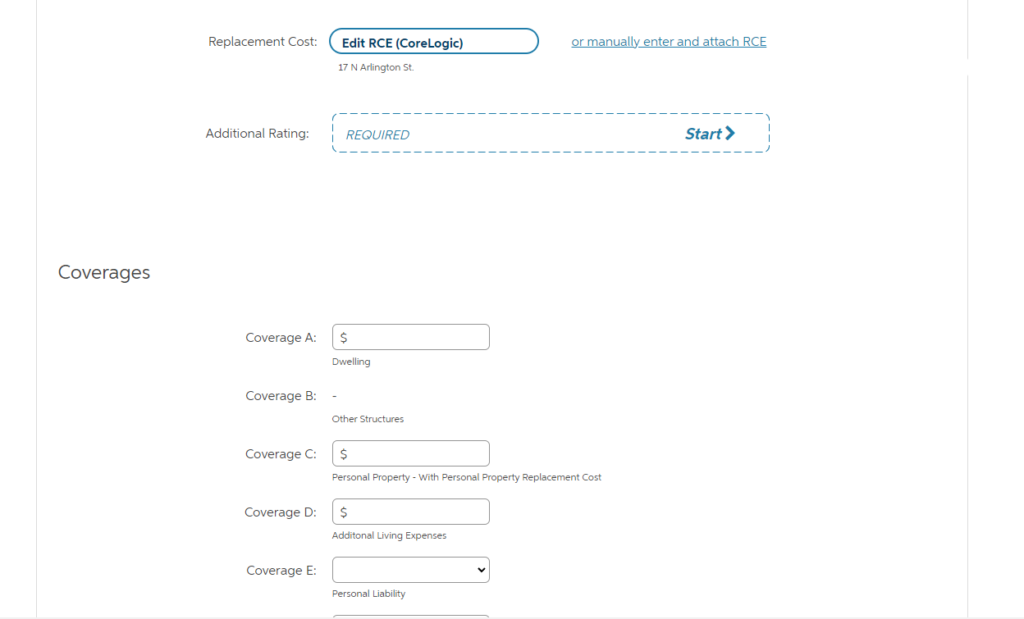
In personal property, it is vital to get an accurate Replacement Cost Estimate in order to properly insure a home. In this case, the user can use a third-party tool or provide their own previously-gathered “RCE”.
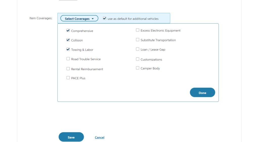
Coverage Selection. A one-at-a-time, simple add to list for coverages was found to be frustrating and cumbersome during routine usability studies. Because of the relatively few data points required for each, the resulting number of clicks added unnecessary friction.
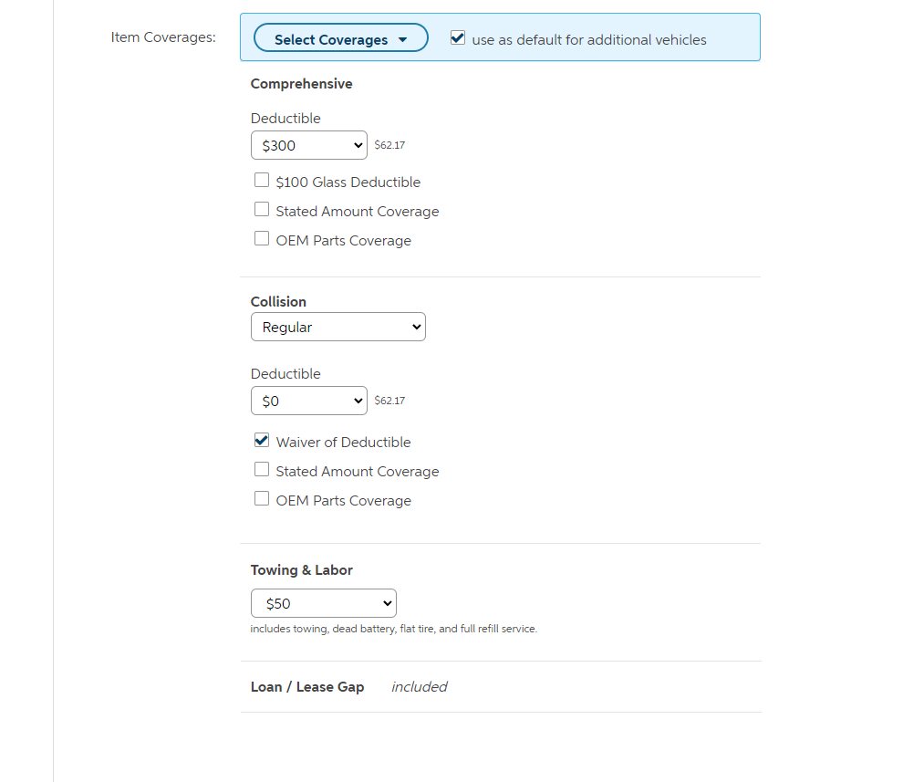
Choosing context over strict consistency, “add many to list” was born. Here, the user can quickly add the (very familiar) coverages they want and promptly address the required input directly in the list. The selector action is given special treatment to provide clear visibility and anchor the section. The options chosen can be easily defaulted for use in subsequent vehicle pages.
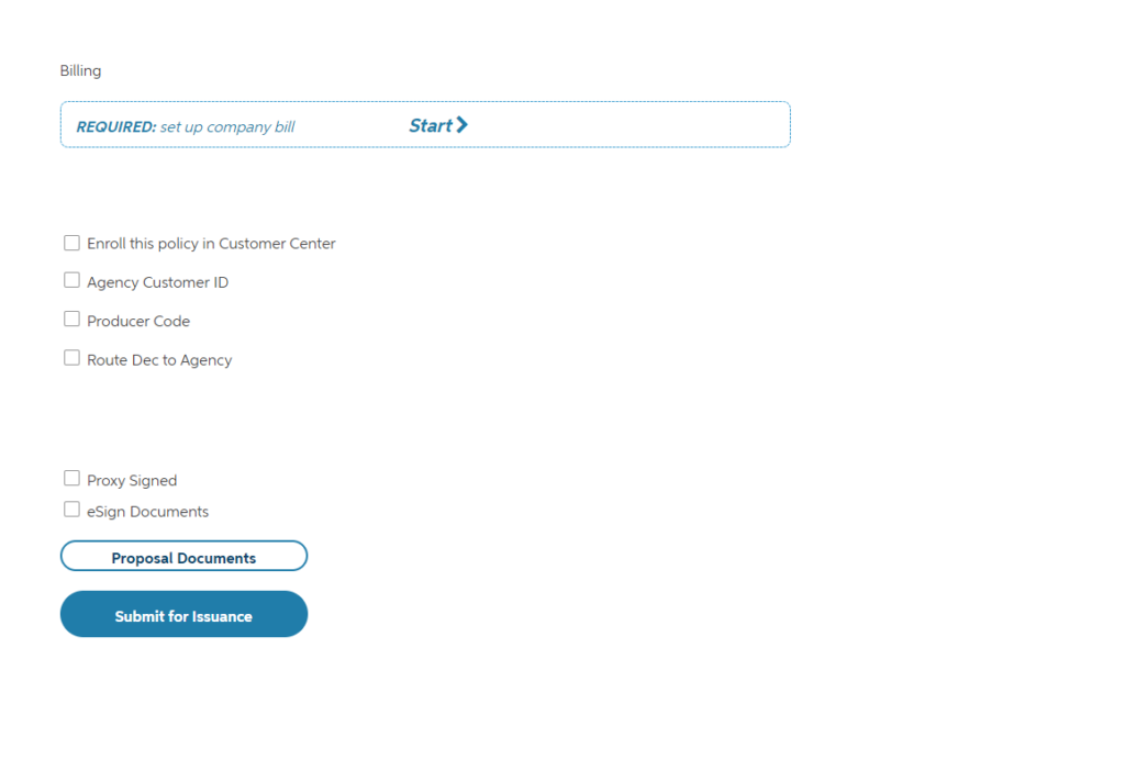
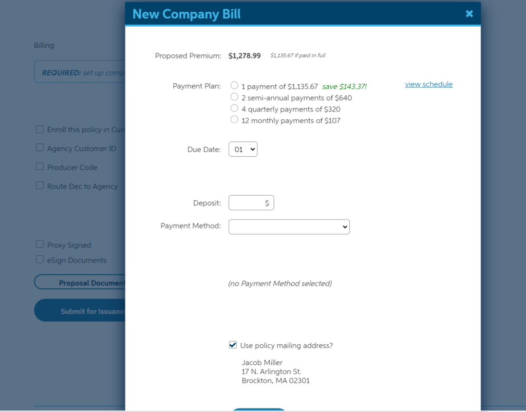
Final Sale and Billing Plan. In the past the finalization of a quote was done on a completely separate set of pages from the rest of the quote, largely due to internal integrations with other development teams. This more modern approach allows the entire flow from start to finish directly on the hub. The user is firmly oriented in the context of the quote, resulting in greater confidence and ease of use. Integration points are seamlessly masked by progressive disclosure.

