This project was a grand scale attempt to paint a picture of the future of Auto-Owners systems and how they could become more tightly integrated with the Customer at the center.
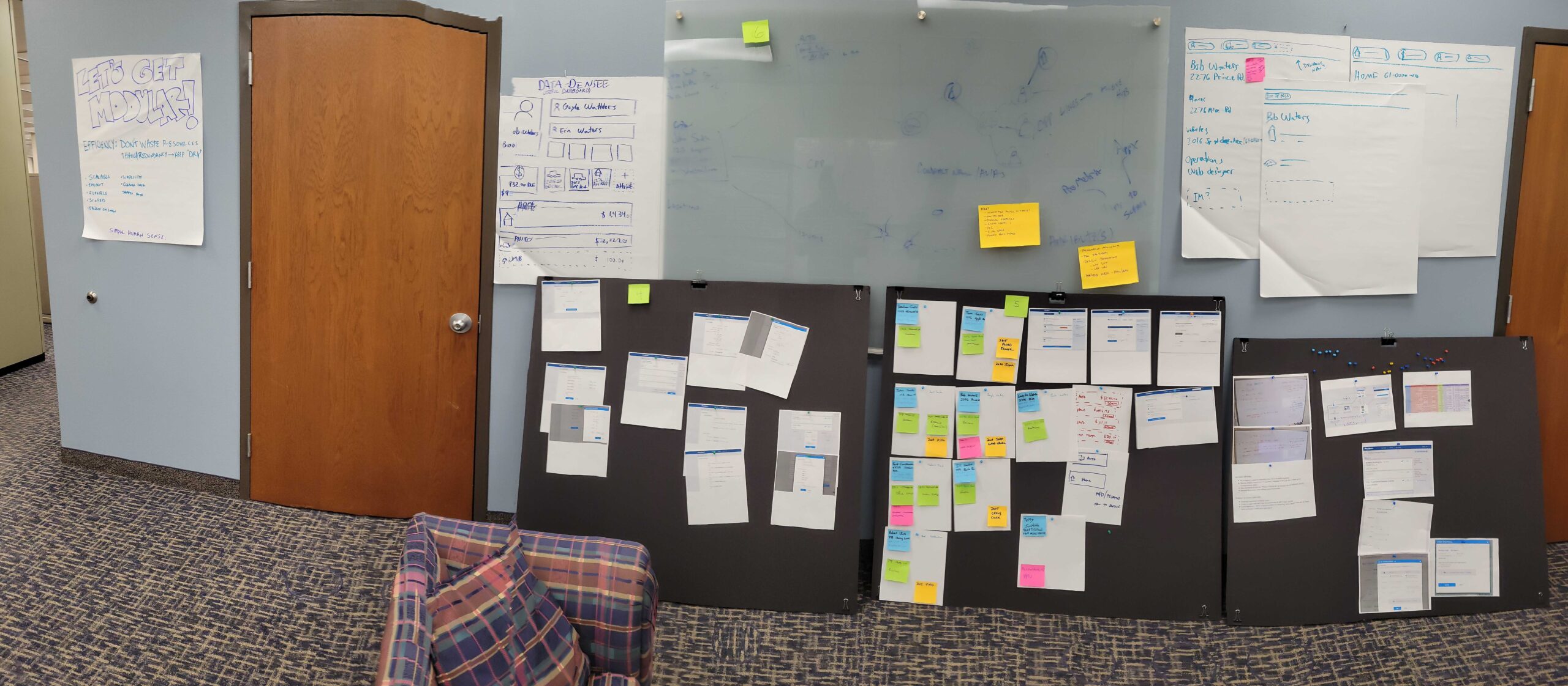
War Rooming. The focus of these sessions was to try to wrangle about 20+ separate efforts going on in the company and demonstrate how much more effective they could be if we make them work and talk with each other. Currently our systems have no central “customer” database — each person resides within each product that we offer. Therefore there is no way to know “Jacob Miller” globally in terms of what products he has with Auto-Owners. This causes problems downstream when they expect to be able to update Name/Address information simply in one place, or sign up for our Customer Portal. And it makes us look like we don’t know what’s going on inside our own company.
Through this exploration we attempted to precisely define exactly what it meant to be a “customer”. The biggest hurdles involved the relationships between customers and the products themselves.
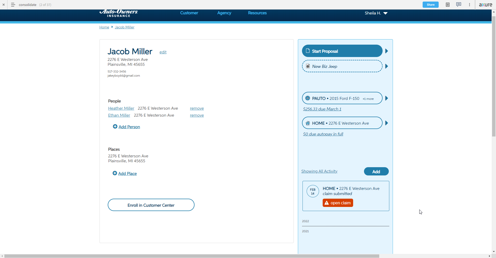
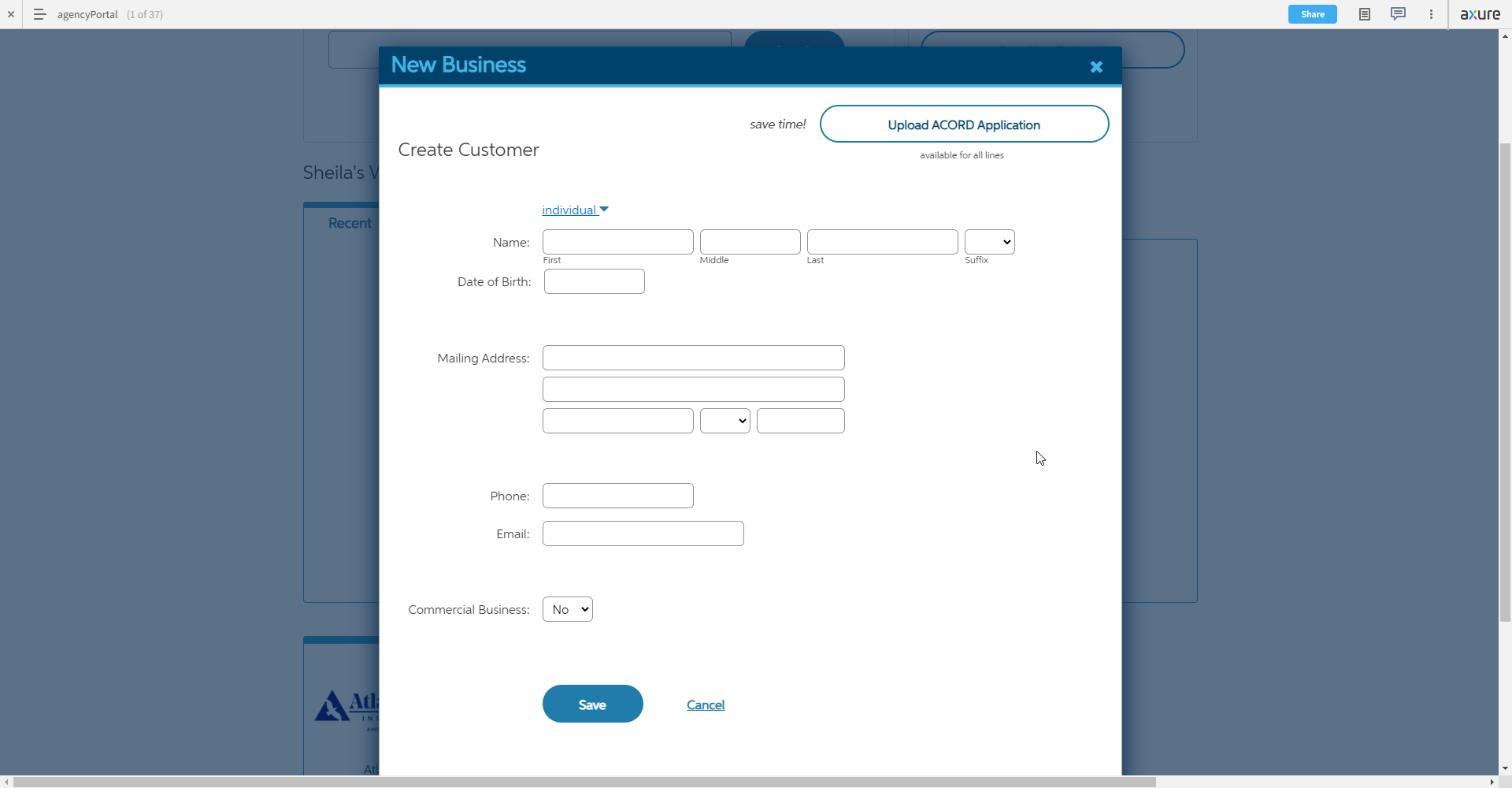
The Customer. The major shift here is making the Customer the core starting point for everything, not an afterthought. Our agents think entirely in terms of their clients, and so should we. This design imagines taking the hub/spoke model and expanding one level further to put the customer as the primary hub. In this way, the customer and any global data to be shared across products can be edited directly. The primary content area tells the story of the actual, real-world person. The navigation bar tells the Auto-Owners story: which products do they have, what is our history with them, and what things would we like to add.
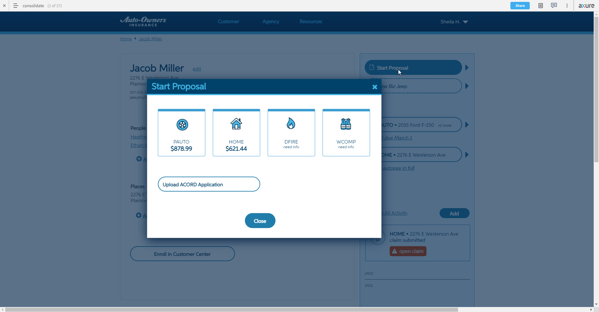
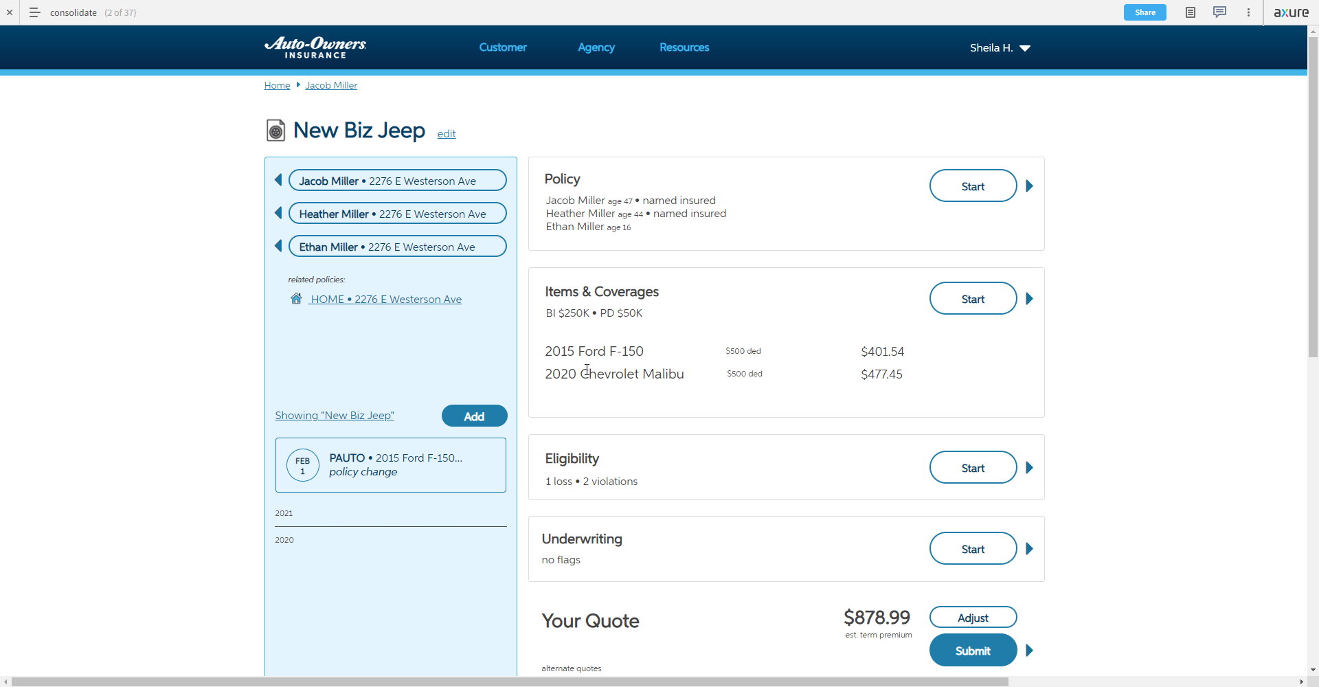
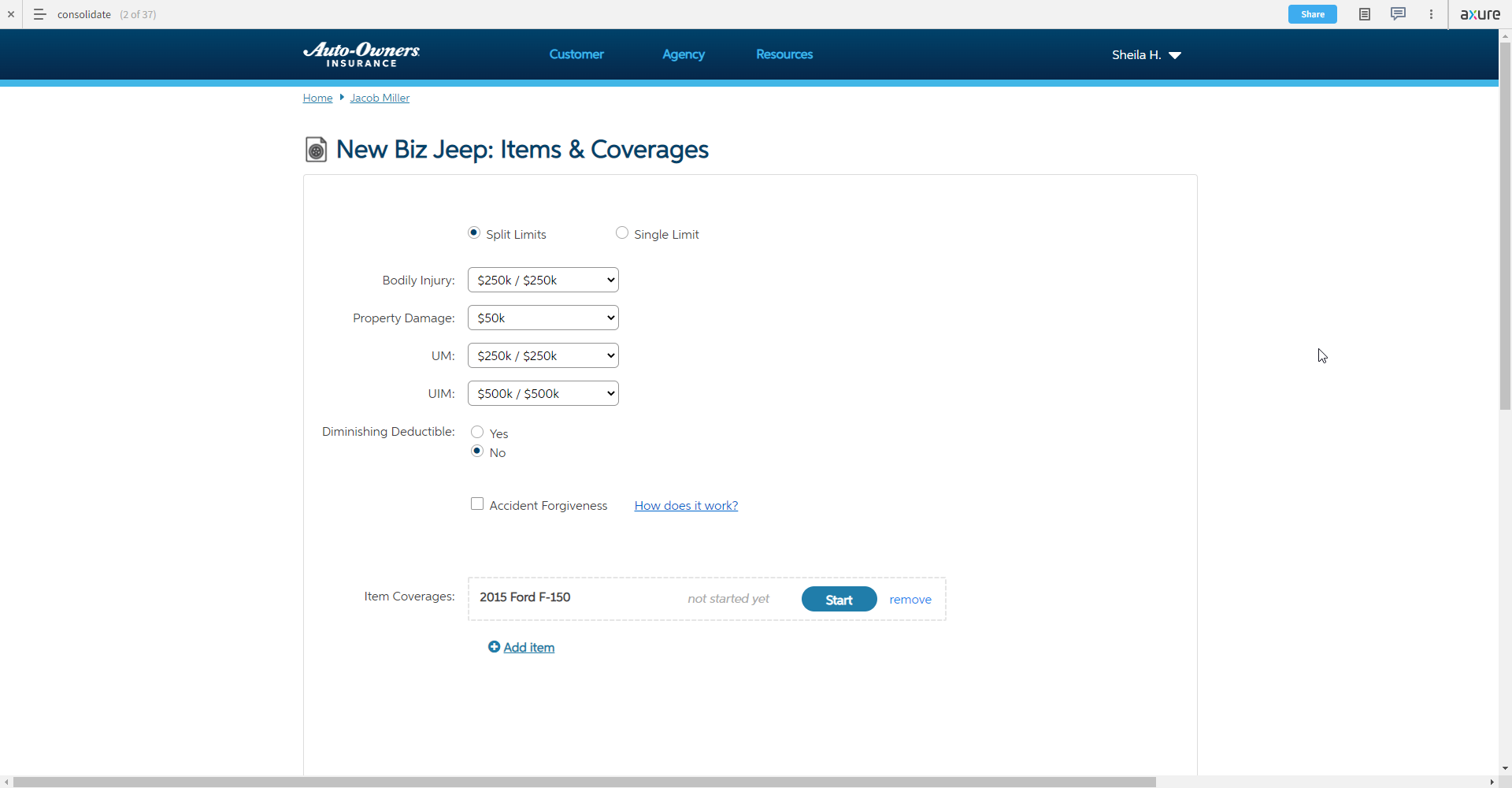
Quoting. Applying lessons learned from Commercial Quoting, we can plug in a similar interface for quotes. Since it is now the “middle step”, the hub has directional cues to keep the user oriented. Left moves backward to the customer(s), and right moves deeper into the quote. We will never have more than 3 levels for the sake of a simple mental model.
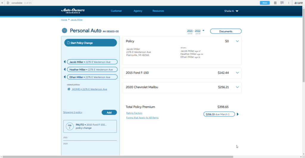
Other Subsystems. Inquiring on an existing policy takes place in the same model “slot” as quoting, only now it’s optimized for administrative duties. We are leveraging the audience’s familiarity with standardized “declaration pages” as a starting point for the information architecture, but a web system gives us the flexibility to progressively disclose information when needed so as not to overwhelm the user.
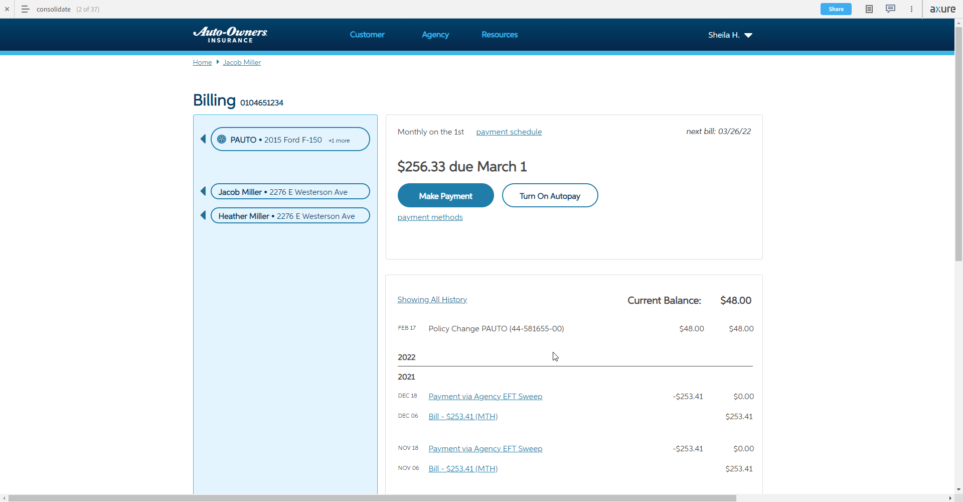
From the Policy page, there is a natural jump into the Billing system which is maintained by yet another team. It appears in the rightmost “slot” so that the transition is seamless. The aim is to make the user feel like they are in one cohesive system.


