This project’s intent was to re-envision the quoting system for the company’s most complex offering, commercial insurance.
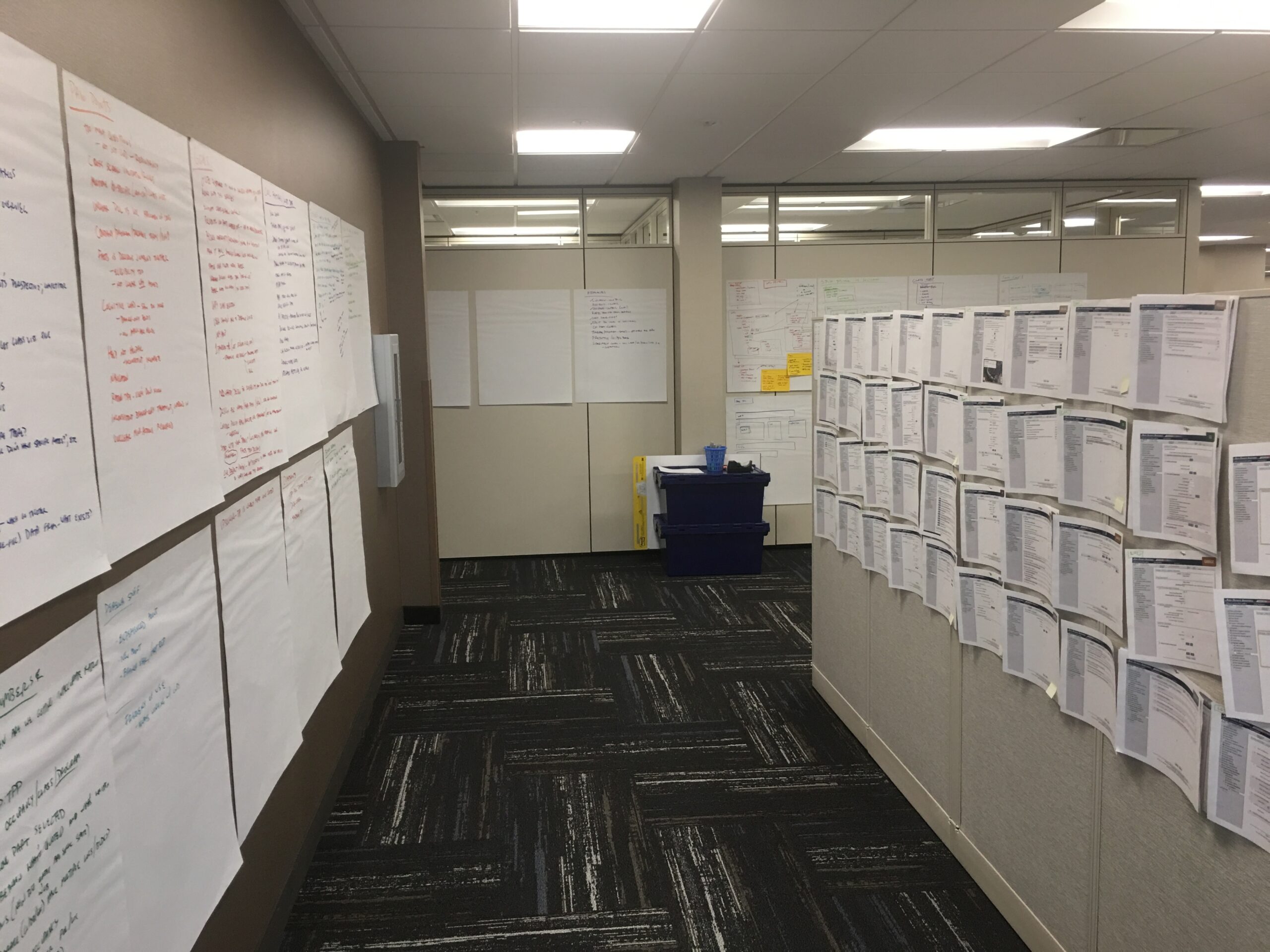
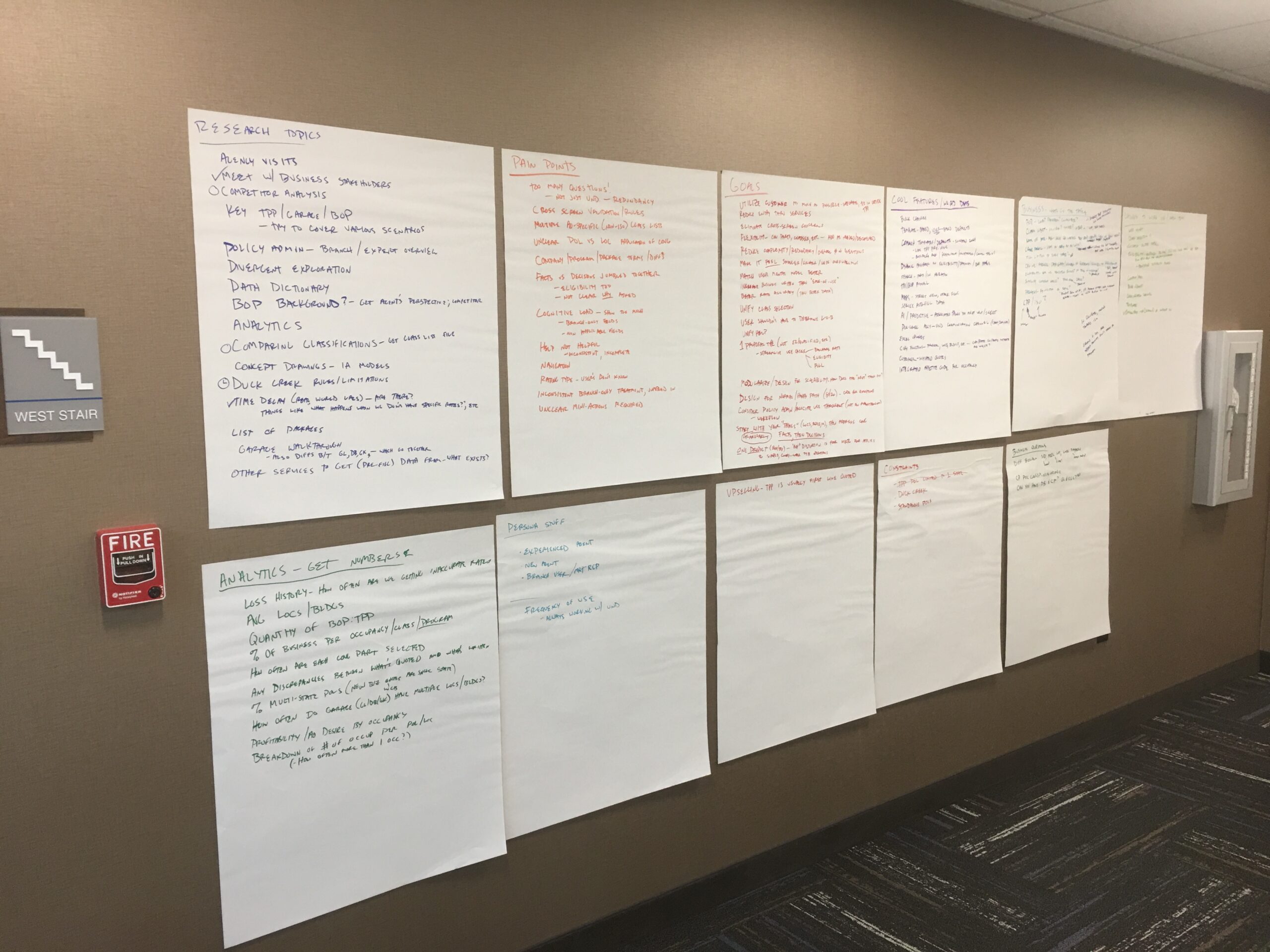
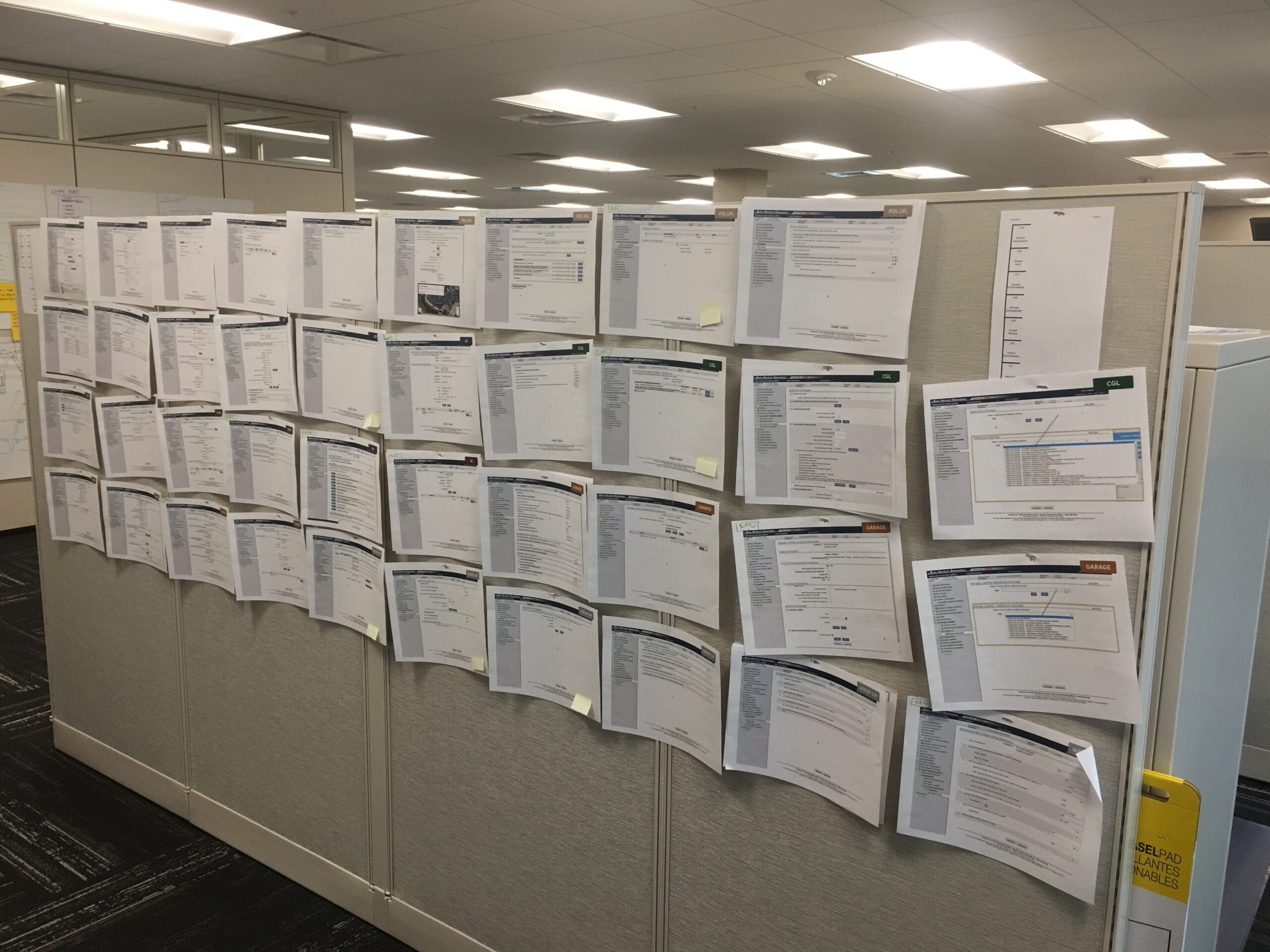
War Rooming. For projects of this scale, I prefer to employ a “war room’ where we dedicate a physical space to the effort. This enhances muscle memory and allows collaborators to quickly jump back to a moment in time when anything was noted on the wall. This speed is critical in drawing new connections and exploring possibilities.
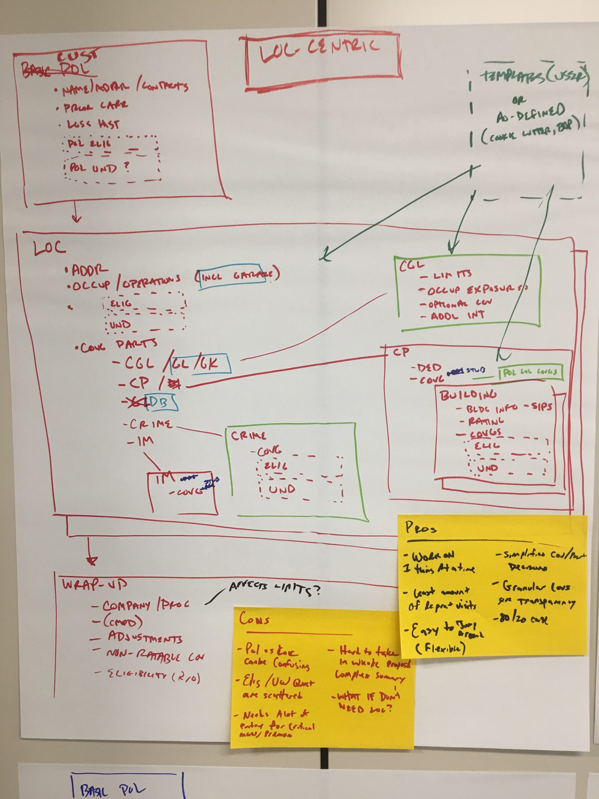
I’ve found the easiest way to begin is with words, not pictures — specifically a “list of lists” where we identify all the running items we want to keep track of. Each list grows organically on its own and in the context of other discussions. We commonly identify pain points, data needs, goals, cool/weird ideas, items needing further research, persona info, business questions, constraints, and anything else needed. We are trying to get everything from inside our brains onto a piece of paper. We will also inventory the current system screens to make sure we are accounting for everything.
A war room seeks to guide us through the first 3 major phases of the Design Methodology. It facilitates “discovery” by listing what we do know and helping identify gaps in our knowledge. We use this discovery to collect pain points and goals in order to define our problem with scope and personas. Out of this we begin our early ideation and concept drawings.
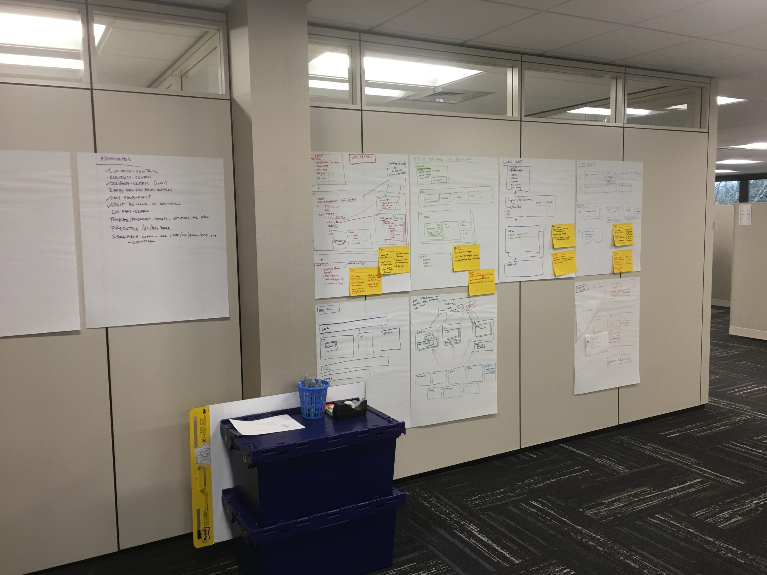
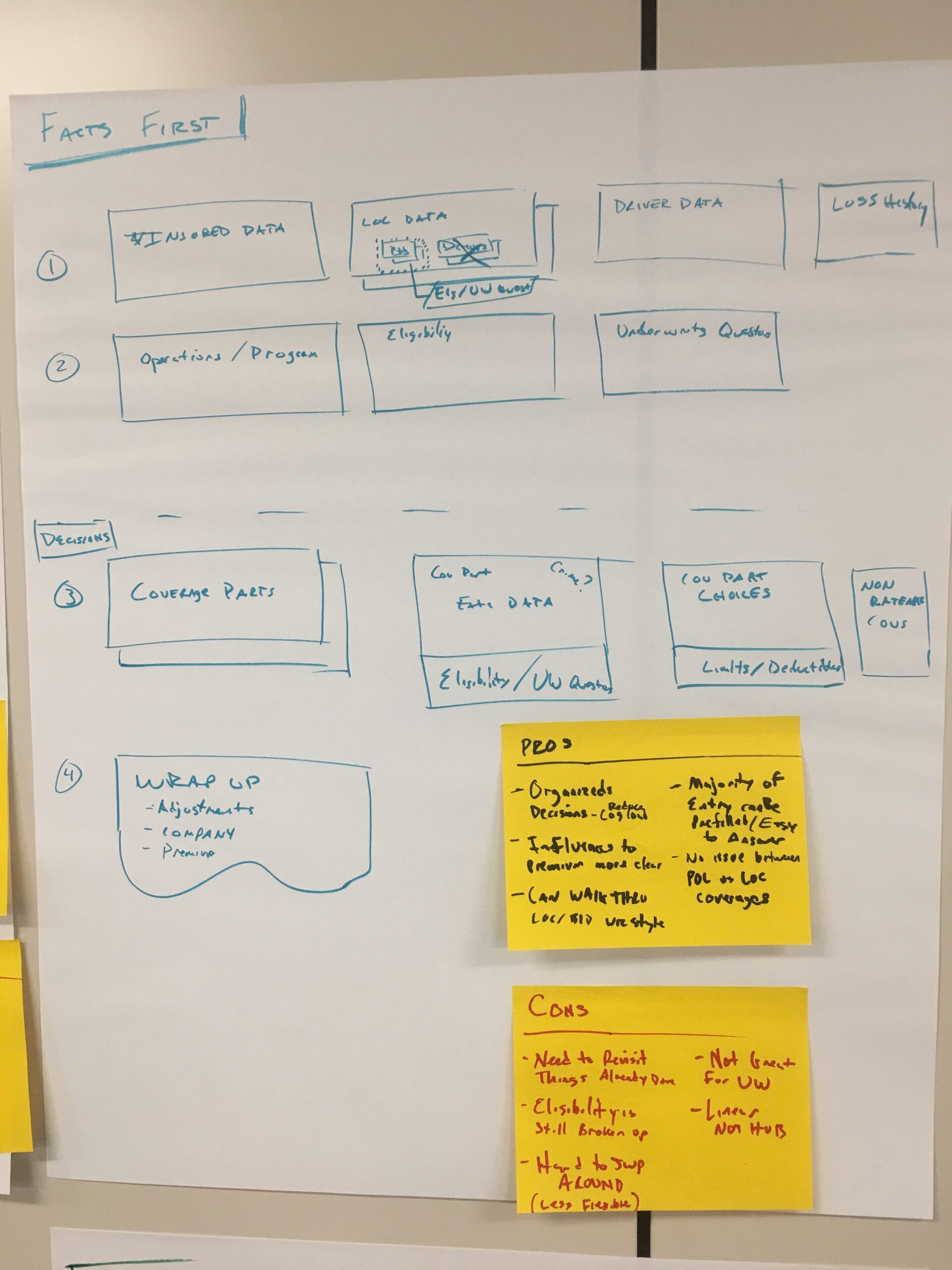
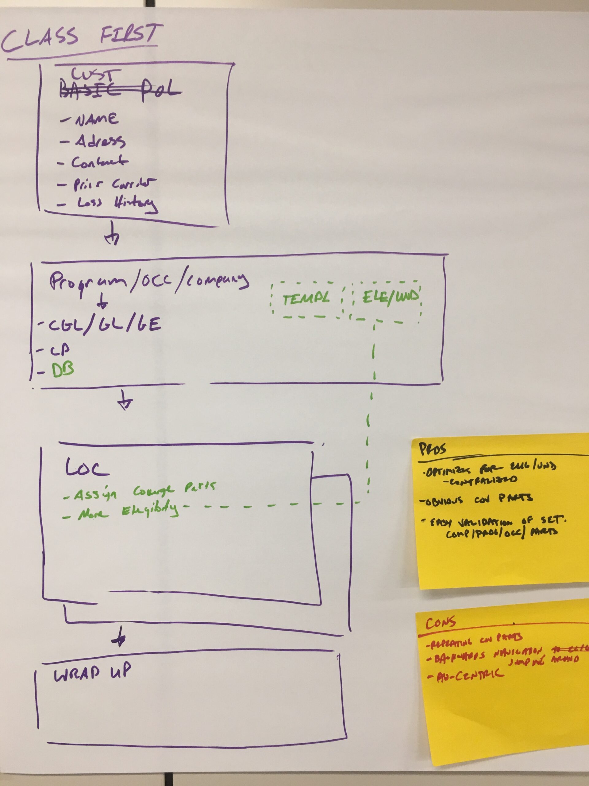
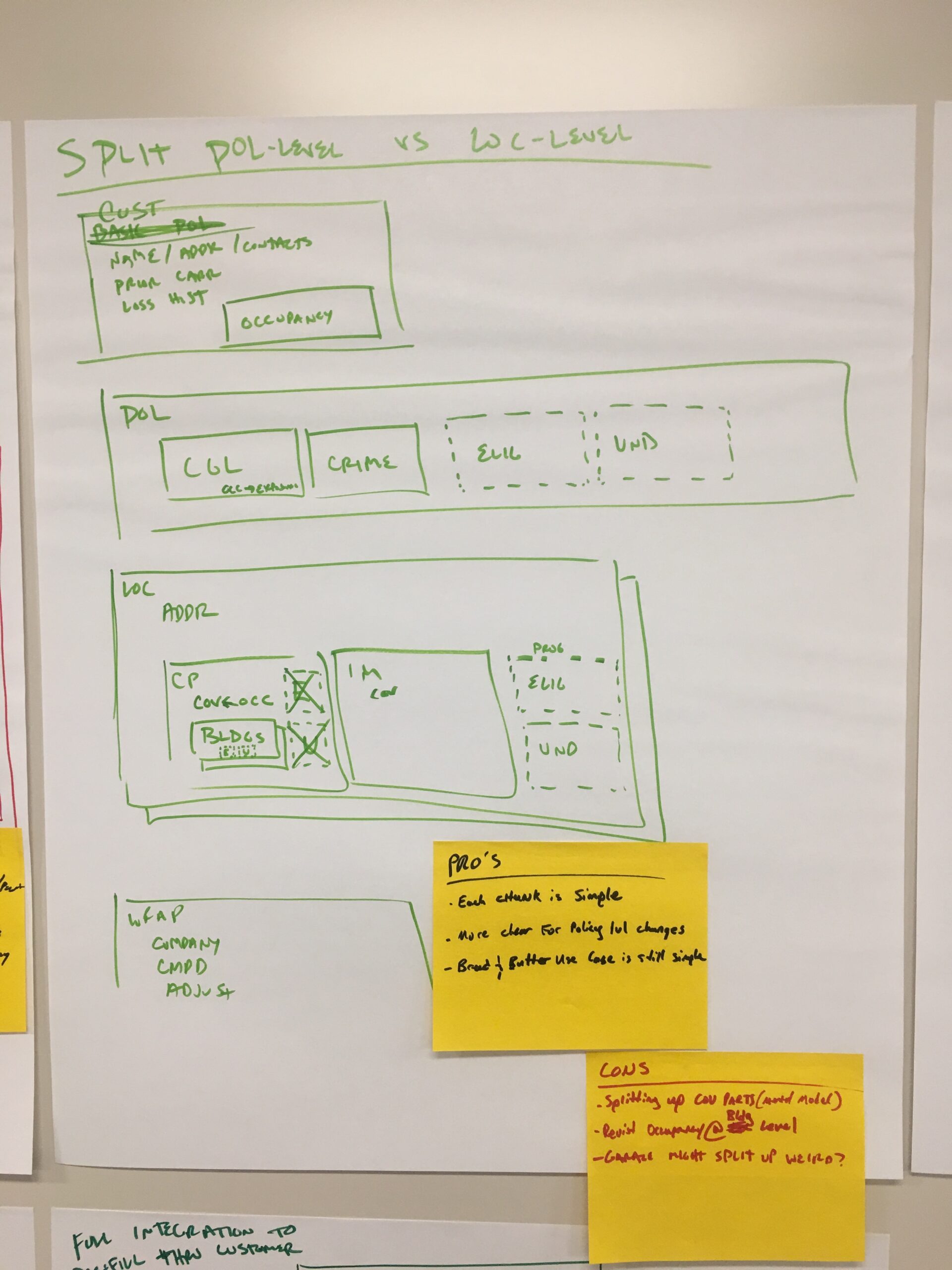
Concepting. Taking what was learned from war room discussions, we begin by drawing high-level concepts or “angles” on the problem. These are not reflective of actual screens, but rather more akin to information architecture approaches. Each represents a novel take on the problem space. We purposely try to make each very different from the last, as the goal of this phase is to generate ideas. Collaborative discussions are at the core of each sketch.
Next, we begin to evaluate with a simple pro/con list of each of the high level approaches. We are not looking to make a final decision necessarily, but to start to pull out the strongest ideas within. In then end, we might follow one path more closely, but we will try to use the best of everything.
These concepts will inform the next phase of low-fidelity paper/pencil sketches that start to resemble actual screens. We will refer to thsee concepts and everything from the war room throughout, as we prepare to prototype.
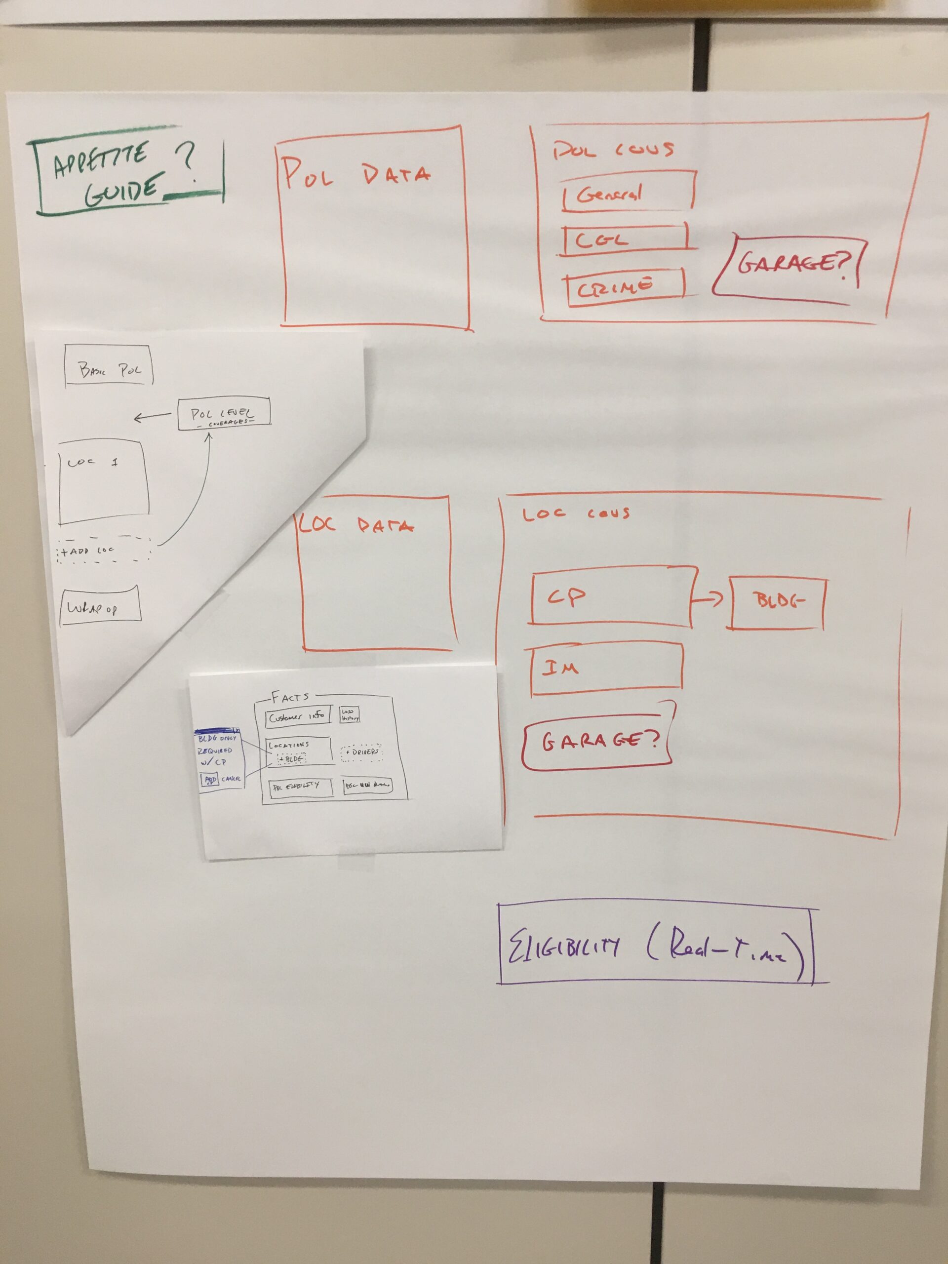
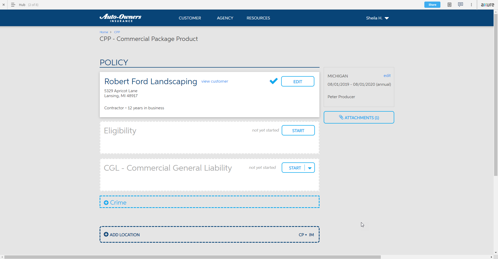
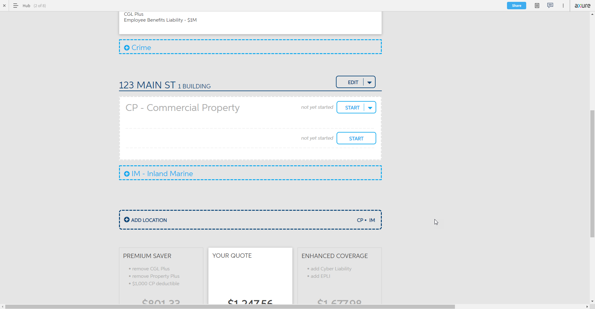
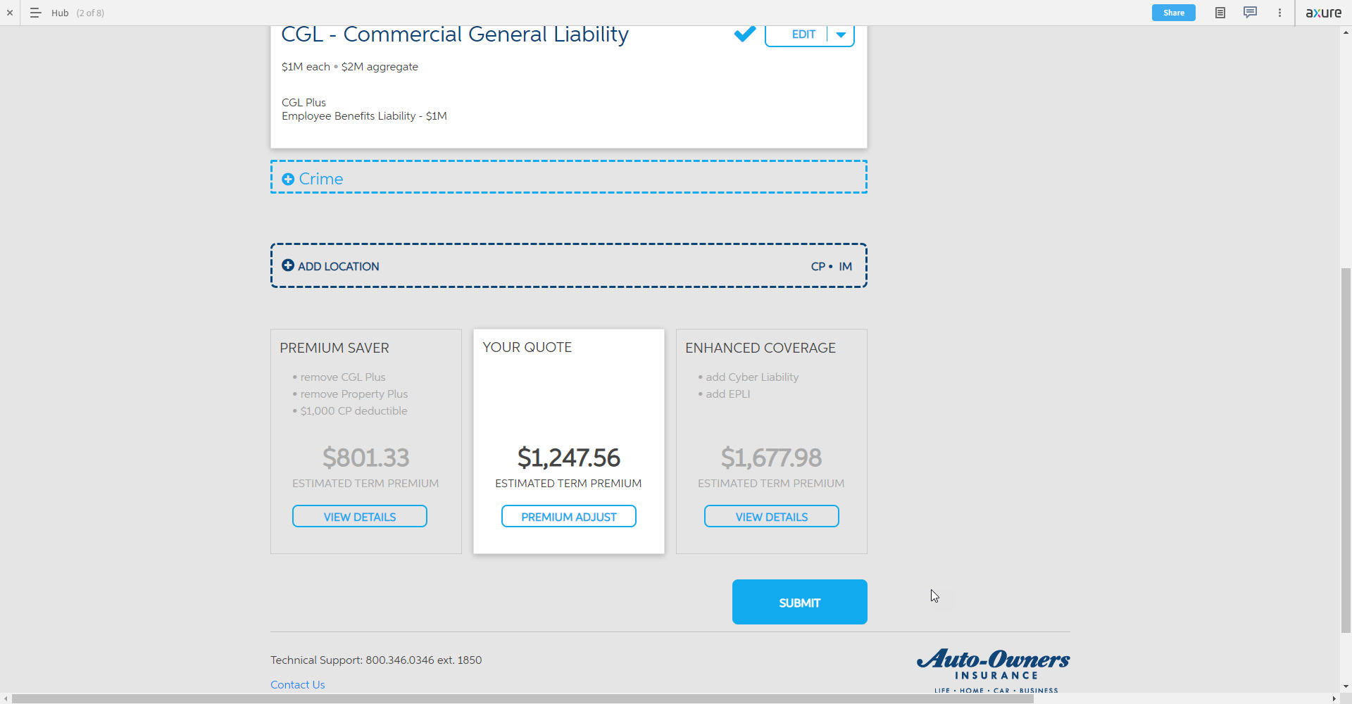
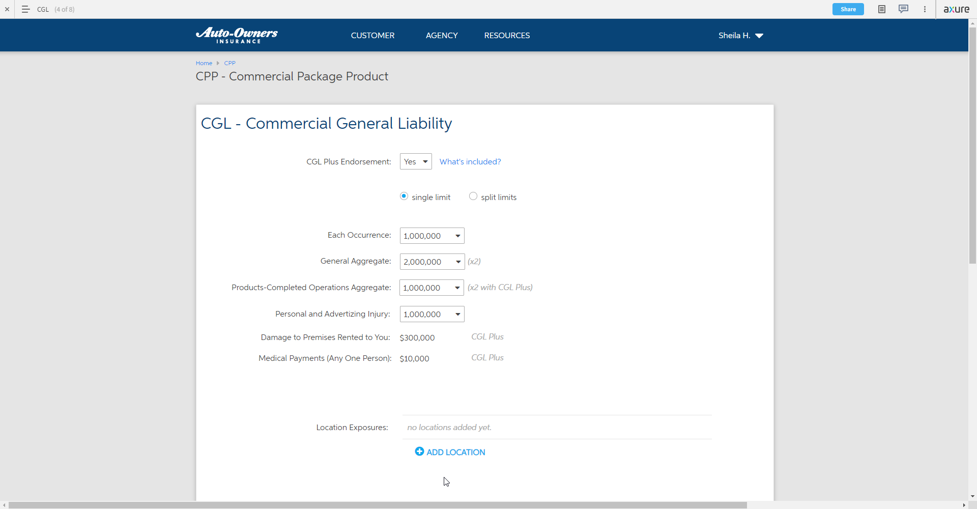
Prototype – Hub / Spoke Model. A central Hub screen serves as the overview for the primary users. This allows for the flexibility to address many different client scenarios and the ever-changing discovery therein. The user can address pieces of commercial insurance in whatever order is applicable for their unique customers.
We only ever allow the user to go one level deeper to the spoke pages, which vastly improves orientation and navigation which was a major pain point. It also helps the system to feel like “4 or 5 pages” instead of the current 40+.
This build-as-you-go approach builds familiarity with the summary Hub page as the user prepares to enter the “final sale” phase. They can freely revisit any area that requires further adjustment, and are presented with additional price points to compare to their core quote.
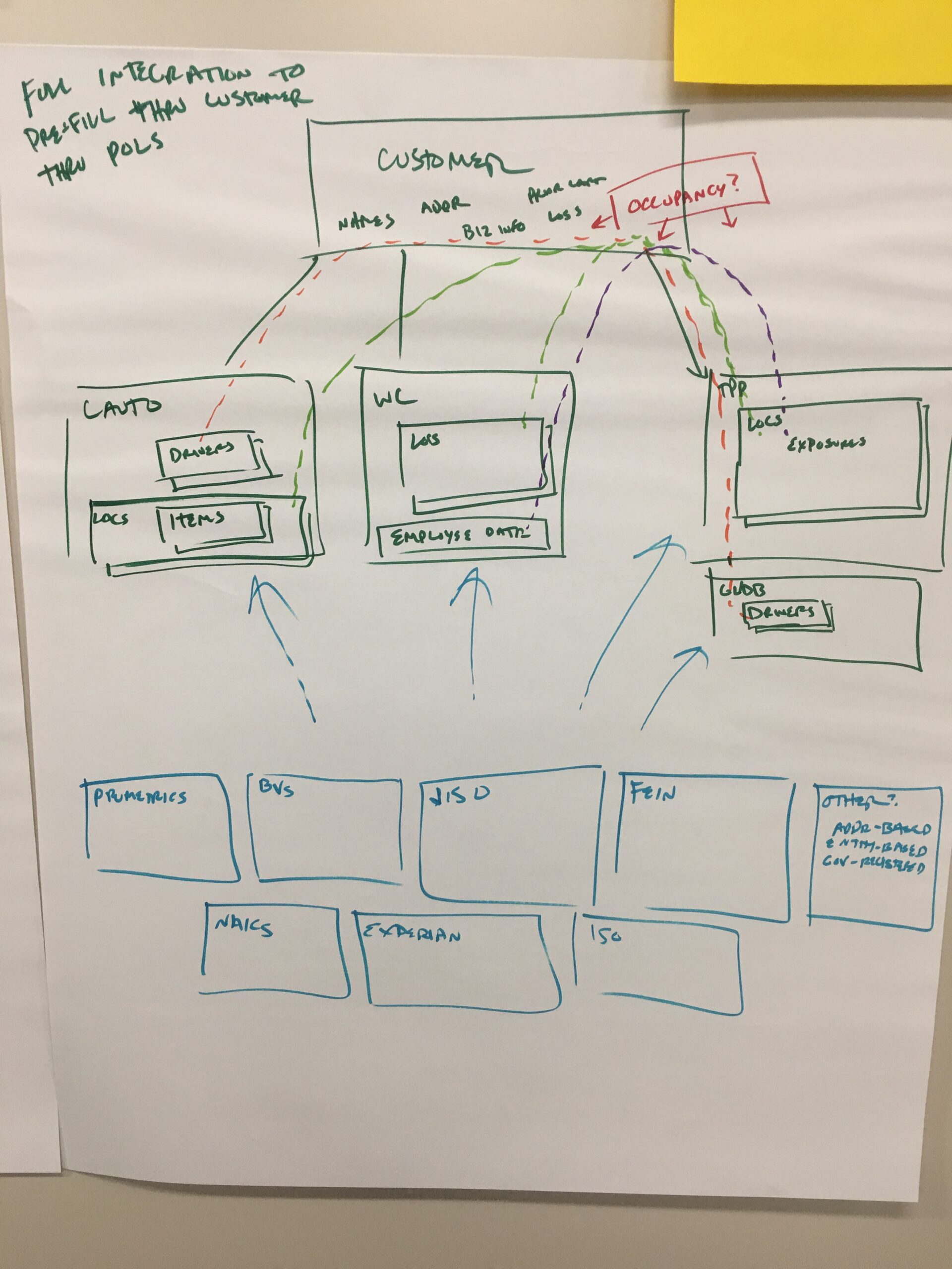
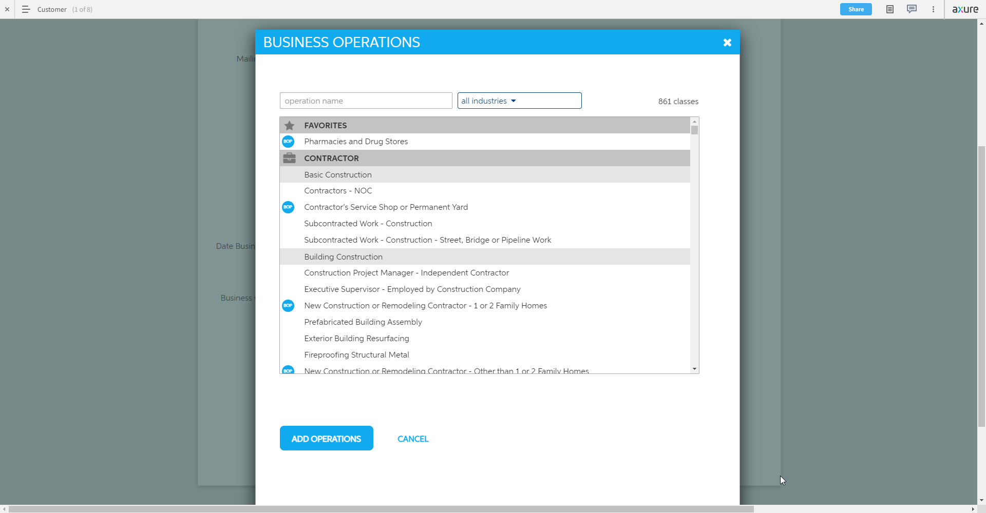
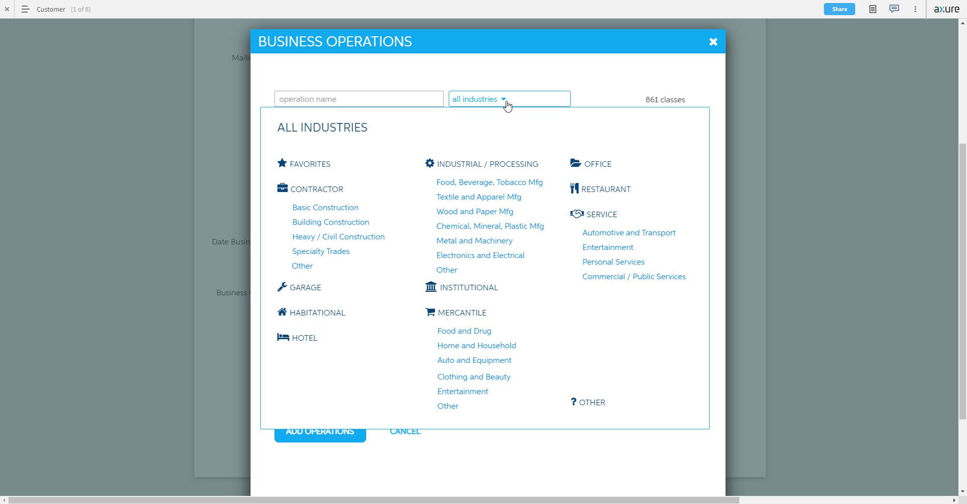
Business Operations Selector. At the heart of commercial insurance is understanding “what does this company do?” They can also do many things, and those things are classified differently by the industry for each “coverage part” of the insurance policy. Sound complicated? That’s because it is.
To combat this complexity, a joint effort was made by the underwriting, actuarial, and design teams to reimagine this confusing landscape as a unified system. If we could create a data structure that properly relates these classifications into a single , searchable list, it could pay major dividends to the user by streamlining the input choices throughout the system. It would have to be done up front and it would have to be extremely intuitive.
We ended up with a list of nearly a thousand items, which sounds terrible but is actually a vast improvement upon the various industry classifications. How to make this list less daunting? break the list down into manageable chunks via IA exercises, and then use that to your advantage. In this case, showing all items in an organized searchable list but also allowing for filtering/browsing by the categorizations. Working with these in tandem and with clear, distinct choices available, this task is much less scary.
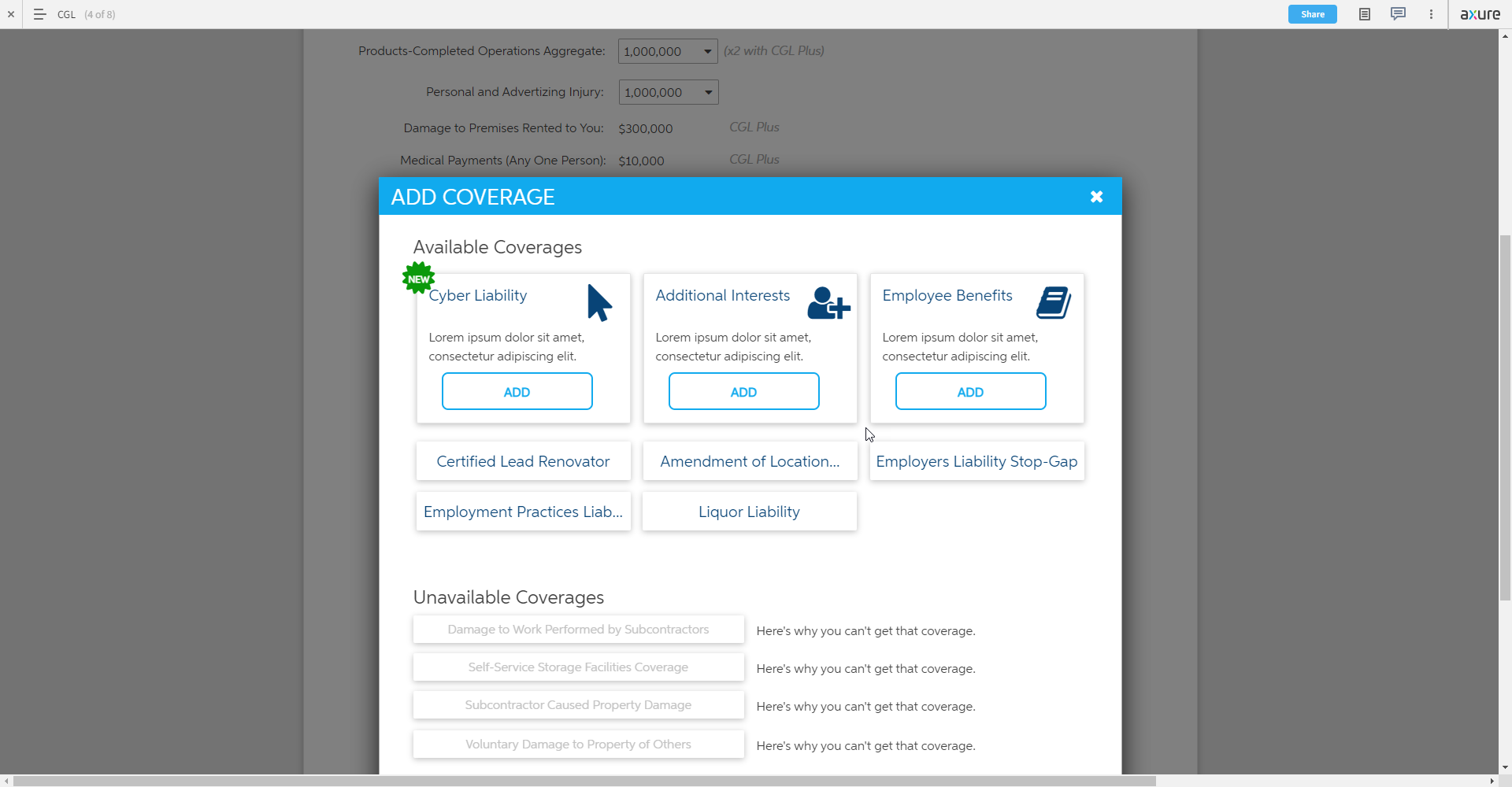
Additional Coverages. A little bit of hierarchy goes a long way. Traditionally, all coverages are presented as one giant list and appear very noisy on the page. It’s quite difficult to find what you’re looking for. This innocent prototype was really just an exercise in provoking the stakeholder’s attention. Not all coverages have to be treated equally – we can highlight new coverages, coverages that we want to “push”, or more importantly coverages that are most likely to be helpful and applicable to the current quote. Easy UX work. Minds blown. Victory achieved. This was the cherry atop an already legendary pitch.